Icon Design
October 10, 2022 at 12:00:00 AM

Icon Design
October 10, 2022 at 12:00:00 AM
Description
For this Icon Project, I was tasked with creating two distinct symbols, each representing a different concept, and ultimately selecting the one that I felt best captured the essence of the idea. My primary objective throughout the process was to design icons that were not only simple and memorable but also distinct and dynamic. These icons needed to be easily recognizable while also conveying a deeper meaning.


To guide my creative direction, I chose to focus on two key sub-words that I felt strongly represented the essence of technology: connectivity and information. These concepts are central to the modern tech landscape, and my goal was to translate them into visual symbols that were both effective and thought-provoking.
Video
To guide my creative direction, I chose to focus on two key sub-words that I felt strongly represented the essence of technology: connectivity and information. These concepts are central to the modern tech landscape, and my goal was to translate them into visual symbols that were both effective and thought-provoking.
Process
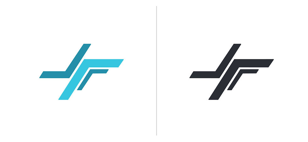
For the first design, I focused on creating an abstract symbol to represent connectivity. The initial inspiration came from the intricate, organized layout of a circuit board, a direct reference to how electrical connections work in the world of technology. However, as I began to experiment with the design, it evolved into something more unique and abstract, moving away from the literal representation of a circuit. The final design became a fluid, interconnected shape, intended to symbolize the seamless, invisible connections that technology facilitates across the globe. I oriented the design to the right, signifying forward motion and progress. This directionality was a deliberate choice, symbolizing the continuous drive toward a more connected and interconnected future—where technology links people, ideas, and information across vast distances.


The second design was more representational, intended to illustrate the concept of information. I chose to use a disc as the central element of this icon. While a disc might be considered somewhat outdated in the context of modern technology, I felt it was a strong, memorable shape that carried significant associations with data storage and transfer. The disc is iconic in tech history, reminding us of early forms of digital data storage, from floppy disks to compact discs. To emphasize the dynamic and ever-evolving nature of technology, I gave the disc a sense of motion by designing it to appear as though it were spinning forward. This forward motion encapsulates the rapid pace at which information flows and evolves, symbolizing the constant generation, transfer, and sharing of data in our digital age. The spinning motion also serves to highlight the ongoing progress and acceleration of technological development, reflecting how the exchange of information drives innovation.
Both designs were thoughtfully created to embody key elements of technology, yet they each approach the themes of connectivity and information from different angles. The abstract design speaks to the invisible, fluid connections that form the backbone of modern communication, while the representational disc captures the tangible, cyclical nature of information transfer. In the end, I chose to move forward with one of these designs for my final icon based on which one I felt was more visually compelling and aligned with the message I wanted to convey. Regardless of which symbol was selected, this project was a valuable exercise in understanding how abstract and representational design can effectively communicate complex ideas. It pushed me to think critically about symbolism and the power of minimalistic design in conveying deep, multifaceted concepts.

Wireframes
For the first design, I focused on creating an abstract symbol to represent connectivity. The initial inspiration came from the intricate, organized layout of a circuit board, a direct reference to how electrical connections work in the world of technology. However, as I began to experiment with the design, it evolved into something more unique and abstract, moving away from the literal representation of a circuit. The final design became a fluid, interconnected shape, intended to symbolize the seamless, invisible connections that technology facilitates across the globe. I oriented the design to the right, signifying forward motion and progress. This directionality was a deliberate choice, symbolizing the continuous drive toward a more connected and interconnected future—where technology links people, ideas, and information across vast distances.
Reflection
Overall, this project was both challenging and rewarding, as it provided an opportunity to delve into the visual language of technology. It was a chance to explore how simple, elegant designs can represent powerful concepts in a clear and memorable way. The lessons learned here will undoubtedly influence my approach to future design projects, particularly when it comes to conveying complex ideas through accessible and impactful visuals.
